App Directory Submission Checklist: Assets You Need
App directory submission checklist: tagline, description, logo, screenshots and URL, with verified character budgets and a done test for each asset.
By Mark Fulton ·
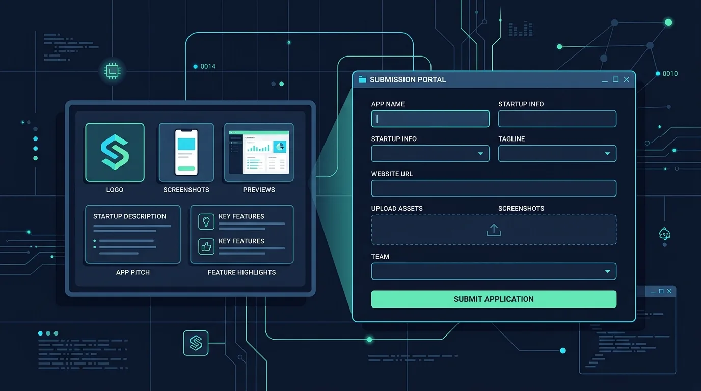
Search this and you get lists of sites. Nobody tells you what goes in the boxes once you get there, which is the part that actually costs you an evening.
Before you open a single submission form, prepare six things: a product name of 30 characters or fewer, a tagline that works at both 30 and 60 characters, a description written to 500 characters, a square PNG logo at 512×512, two landscape screenshots around 1270×760, and a live URL that loads for a stranger with no account. That pack fills every field on a Product Hunt launch, an App Store product page, a Google Play listing, and a dozen indie directories (including ours) without you rewriting anything.
The rest of this post is that pack, field by field, with the character budgets I verified against real submission forms this week and a "done" test so you know when each piece is finished. Build it once and a dozen submissions become an hour of pasting instead of a week of procrastination.
What do directories ask for that you don't have yet?
Almost every submission form is the same seven fields wearing different labels. The problem isn't that the fields are hard. It's that you meet them one at a time, mid-form, and end up writing your product's tagline in a text input at 11pm with the tab already open.
Here's the whole pack. Budgets in this table are safe common denominators: the tightest verified limit across the forms I checked, so a piece written to this size never needs cutting down.
| Asset | Safe budget | Where the number comes from | Done when |
|---|---|---|---|
| Product name | ≤ 30 characters | Apple's stated app name cap | It's just the name: no tagline bolted on, no emoji |
| Tagline | 60 characters, plus a 30-char cut | Product Hunt's stated tagline max is 60; Apple's subtitle cap is 30 | A stranger can say what the product does after reading it once |
| Short description | ≤ 80 characters | Google Play's short description limit | It reads as a sentence, not a truncated paragraph |
| Description | ≤ 500 characters (2 to 3 sentences) | Product Hunt's stated description max | Covers what it is, who it's for, and why it exists |
| Logo | 512×512 square PNG | Google Play's icon spec; downscales cleanly to Product Hunt's recommended 240×240 thumbnail | Legible at 48px on a phone, no text in the mark |
| Screenshots | 2 images, ~1270×760 | Product Hunt requires two gallery images and recommends 1270×760 | Each one shows the product doing its job, not an empty state |
| Live URL | The real https URL | Every form | Loads in a private window, no login wall in front of the value |
| Maker name + one-line bio | Name plus ~150 characters | No universal cap I could verify; treat as a working default | Says who you are and why you built this, in one breath |
Two things that trip people up and aren't on the list: an email you'll actually read (approvals and rejections go there, and a bounced address is a silent rejection), and a category choice. Most directories give you a fixed dropdown, so decide in advance which single word describes your app ("productivity", "developer tools", "design") and stop relitigating it on every form.
How long should your tagline and description be?
Write the tagline three times, at three lengths. This is the single highest-leverage thing in the pack, because taglines are where the caps differ most and where a form will silently truncate you.
- 30 characters. The tightest slot I verified: Apple's App Store product page docs put both the app name and the subtitle at 30 characters each. At this length you get a category and a verb, nothing else. "Invoices for freelancers."
- 60 characters. Product Hunt's launch preparation guide states a 60-character maximum on the tagline. This is the workhorse. Most indie directories sit at or above it, so a 60-character tagline pastes almost everywhere untouched.
- 80 characters. Google Play's short description limit is 80 characters, and our own submission form caps the tagline field at 80 too. If you have a 60, you don't strictly need this one, but the extra 20 characters are where a specific noun fits, and specific beats clever.
The done test for a tagline: read it to someone who doesn't know what you built and ask them what the product does. If they answer with a question, it isn't done. Cleverness that requires the reader to already know the product is the most common failure here, and it's expensive: on a directory index page, the tagline is the only thing most people ever read.
For the description, write to 500 characters. That's Product Hunt's stated maximum, and it's the tightest description cap among the forms I checked. Apple allows up to 4,000 characters on the product page and our form takes 600, but a piece written to 500 pastes into all of them and a piece written to 4,000 has to be hacked apart on every form that isn't Apple's.
Three sentences, in this order: what it is, who it's for, what makes it different from the obvious alternative. Skip the origin story. Save that for a Show HN post or your first comment on a launch. Skip adjectives that could describe any software ever written. If your description would still read fine with a competitor's name swapped in, it isn't describing your product.
One more discipline: write it in third person or neutral voice ("Tracks invoices for freelancers who bill hourly"), not "we". Directory editors frequently rewrite listings into house voice, and neutral copy survives that edit with your meaning intact.
What logo and screenshot sizes cover most forms?
One square PNG and two landscape screenshots cover the overwhelming majority of submission forms. The specs below are the ones I pulled directly from platform documentation this week.
Logo: export at 512×512, PNG, square. Google Play's listing asset requirements specify a 512×512 app icon as a 32-bit PNG with alpha, under 1024KB. That single export also covers Product Hunt, whose launch guide requires a square thumbnail, recommends 240×240, and caps it under 3MB. A 512 image downscales to 240 cleanly, while a 240 upscales to 512 badly. Export once at the larger size.
The done test for a logo: shrink it to 48 pixels wide and look at it on your phone. Directory cards render logos small. A mark with your product name written inside it turns into grey mush at that size, which is why the good ones are a single letterform or a simple shape.
Screenshots: two images, landscape, around 1270×760. Product Hunt requires two gallery images and recommends 1270×760. Google Play's requirements are looser but bounded: at least two screenshots across different device types, a maximum of eight per device type, and every image between 320px and 3840px on its shortest and longest sides, as JPEG or 24-bit PNG without alpha. Apple's product page docs allow up to ten screenshots and up to three app previews of thirty seconds each. So if you have ten, great, but two good ones satisfy the floor everywhere.
The done test for a screenshot: it shows the product with real data in it, doing the thing. Empty states are the single most common screenshot mistake. A blank dashboard with a "no items yet" message tells a browsing stranger nothing, and it's what you get if you screenshot a fresh account. Seed some plausible data first.
If your app has a genuinely visual moment (a result appearing, a file converting), a short GIF earns its place as the second image. Product Hunt's gallery accepts animated GIFs. Nothing else on this list benefits as much from motion.
What makes a URL "submission-ready"?
The URL is the one field with a binary outcome: it works or your submission gets rejected, and most directories won't tell you which. Reviewers open your link, spend about fifteen seconds, and make a call.
A submission-ready URL passes all six of these:
- It's https and it's the final URL. No redirect chains, no shortened links, no UTM parameters. Product Hunt's guide explicitly asks for a direct link with no shortened or tracking links, and most reviewers feel the same way about a link that bounces twice before landing.
- It loads in a private window. Open an incognito tab and paste it. This catches the classic failure where the site works perfectly for you because you're logged in.
- The value is visible before signup. A reviewer who hits a login wall with nothing behind it usually stops there. A screenshot, a demo, a live example, or a no-account trial path: any of these is enough.
- Someone can actually try it for free. This is a hard policy on TryMy.App: fully free, free trial, or freemium all qualify; paid-only doesn't. Many indie directories run the same rule, because the whole point of a showcase is people trying things. Check each directory's stated policy before you spend the twenty minutes.
- It's the domain you're keeping. Every listing you earn points at whatever URL you submitted. Moving later costs you all of them.
- It doesn't 500 on mobile. Half of directory browsing happens on a phone. Open your own link on yours.
Worth knowing what the URL field will tolerate: our submission API accepts a URL up to 300 characters and an email up to 200, and rejects anything that isn't a valid http/https URL outright. Those are generous caps. If you're anywhere near them, your URL is carrying tracking junk that should come off.
How do you reuse one asset pack across every directory?
Put all of it in one plain text file, not in your head and not in a design tool. Something like this, saved next to your project:
NAME (30):     Ledgerly
TAGLINE (30):  Invoices for freelancers
TAGLINE (60):  Send invoices and chase payment without leaving your inbox
SHORT (80):    Invoicing for freelancers who bill hourly and hate chasing payment
DESC (500):    Ledgerly turns tracked hours into a sendable invoice in one click...
URL:           https://ledgerly.example
EMAIL:         you@example.com
CATEGORY:      Productivity
PRICING:       Free trial
MAKER:         Jane Maker, solo dev, built this after six months of chasing late invoices
LOGO:          ./press/logo-512.png
SHOTS:         ./press/shot-1.png  ./press/shot-2.png
Three habits make the file worth keeping:
Keep the length variants in the file, not in your memory. The reason people rewrite their tagline nine times is that they saved one version and every form wanted a different length. Save all three and the rewriting stops.
Keep the assets in the same folder as the file. A press/ directory in your repo with the logo and screenshots means the file upload step is two clicks instead of a hunt through Downloads.
Update it when the product changes, not when you next submit. Directory listings are durable (that's the whole reason to bother with them, as I argued in Where to Post Your App in 2026), and a stale description sitting on twenty pages is worse than no description. When you ship something that changes the pitch, change the file the same day.
One caveat about copy-paste: reuse the assets everywhere, but don't paste the identical description into fifty sites and call it a strategy. Search engines discount that pattern, and more practically, some directories reject duplicate copy on sight. Vary the middle sentence per site. The name, tagline, logo and screenshots can be identical everywhere without any downside.
What should you do before you submit anywhere at all?
Two things, both boring, both saving you more time than they cost.
Get three people to actually use it first. Not to praise it, but to use it, while you watch or while they tell you where they got stuck. Directory reviewers behave exactly like a stranger with no context and fifteen seconds, which is precisely what a fresh tester simulates. Every confusion a tester hits is a confusion a reviewer will hit, except the tester tells you about it. If you don't have three people handy, a builder community is the fastest source. Favors.dev exists for exactly this trade: favors like "test my app" get you points you spend when it's your turn to launch.
Fix the empty state. It's the first thing a stranger sees and the last thing anyone building an app looks at. A first screen that clearly points at the first action does more for your submission acceptance rate than any tagline rewrite.
Then sequence your submissions sensibly. Directories are the before work, not the launch-day work. Get a handful of listings live in the weeks leading up to launch so there's something for search engines to have already crawled when your launch day traffic arrives. The day itself belongs to the launch platforms and the replies, which is what the launch day checklist for solo developers covers hour by hour.
The honest version of what this pack is worth
A directory listing is a slow asset, not a spike. It's a page that exists for years, a link search engines can follow, and a trickle of people who browse showcases because they enjoy trying new things. That trickle is small. It's also cheap: one hour of prep, ten minutes per form.
Which is why the asset pack matters more than the directory list everyone else publishes. The list is free; dozens of people maintain one. The hour of preparation is the part nobody does, and it's the difference between twelve listings and two.
You've got the pack. Now submit your app free. Our form is deliberately the shortest one you'll fill in this week: a URL and an email are the only required fields, because we'd rather open the app and write the listing ourselves than make you retype your description a thirteenth time. Everything else on the form is optional, and if you paste your own tagline and description we'll usually keep them. A person reviews every submission before it goes live, which is why free listings take a few days rather than a few seconds. Featured placement is the paid option: a position at the top of the directory, a badge, and faster review. It's a placement, not a traffic promise, and we won't pretend otherwise.
FAQ
Do I need screenshots to submit my app?
For most directories, yes, and two is the number to aim for. Product Hunt requires two gallery images before you can launch, and Google Play requires at least two screenshots across different device types. Some smaller directories will take a listing without them, and a few (ours included) will take a screenshot themselves. But a listing without images gets skipped by browsers on every showcase page it appears on, so the two exports are worth the twenty minutes even where they're optional.
How long should an app tagline be?
Write one at 60 characters and a cut-down version at 30. Product Hunt's launch guide sets a 60-character maximum on the tagline, and Apple's product page docs cap both the app name and subtitle at 30 characters each. Google Play's short description allows 80 and our own form accepts 80, so a 60-character tagline fits everywhere without editing while the 30-character version covers the tightest slots. If you can only write one, write the 60.
Should I submit before or after launch day?
Before, for most directories. Listings take days to review and index, so submitting a week or two ahead means the pages already exist when your launch traffic and search crawlers arrive. Launch-day platforms are the exception: those are timed events you schedule for the day itself. The practical split: directories in the quiet weeks before, launch platforms and communities on the day.
Can I submit an app that's still in beta?
Usually yes, as long as it works and a stranger can try it. "Beta" isn't the disqualifier; a login wall with nothing behind it, a broken signup, or a waitlist page with no product are. Say plainly in your description that it's in beta. Most directories and most early adopters are fine with rough edges and much less fine with a surprise. On TryMy.App the bar is that it's real, working, and free to try in some form; a beta that meets that gets listed like anything else.
Sources
- Product Hunt, Preparing for launch: content checklist: tagline and description maximums, thumbnail and gallery image requirements
- Apple, Creating your product page: app name, subtitle, promotional text and keyword character limits; screenshot and app preview counts
- Google Play Console Help, Add preview assets to showcase your app: short description limit, icon and feature graphic specs, screenshot counts and dimension bounds