How to Write an App Description for Directories
Your app description gets a directory listing approved or rejected. The directory version: three sentences, no origin story, with a full rewrite shown.
By Mark Fulton ·
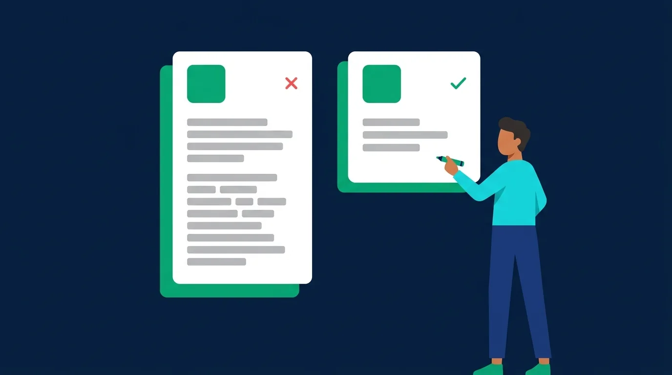
Write two or three sentences that name the user, the job, and the mechanism, and then stop. Sentence one says who it is for and what it does. Sentence two says how it does it, in plain mechanical terms a stranger can picture. Sentence three, if you need it, states the boundary: what it does not do, who it is not for, or what the free tier covers. Cut every adjective, cut the origin story, cut the mission statement, and cut anything a reviewer cannot verify by opening your link. That is the whole format, and it is the version that gets approved.
Most advice you find on this is written for a different field. Some of it is app store optimisation guidance, aimed at a 4,000-character page with bullet lists and testimonials. Some of it is written for people selling an app to a buyer, where the reader wants revenue history and traffic sources. Neither of those is the box in front of you on a submission form. That box is short, it is read by a human moderator in under a minute, and it is the single field that decides whether your listing goes live.
Below: what the field is actually doing, why the founder story is the most common reason a submission comes back, the three-part first sentence, a full before and after rewrite with every change explained, and how to cut one description down to fit any form you meet.
What is a directory description actually for?
It has two readers, and they want opposite things.
The reviewer is deciding one question: is this a real, working thing that a visitor could try today? They have your URL open in another tab. Your description is the claim, and the URL is the evidence. When the two match, approval takes ten seconds. When the description is a paragraph of adjectives and the site is a waitlist page, the mismatch is the whole problem, and it reads as a submission that is not ready rather than an app that is bad.
The visitor arrives later, from a category page or a search result, having already read your tagline on a card. They clicked because the tagline promised something specific. The description has to pay that off immediately, with detail the card could not carry.
Both of those readers are scanning, not reading. Nielsen Norman Group's guidance on the inverted pyramid in writing for the web is the right model here: put the conclusion first, rank everything after it by how much the reader needs it, and accept that people will stop at any point. The useful property of that structure is that it survives truncation. A directory that shows the first 140 characters on a card still shows something complete. A description that builds to its point over four sentences shows a fragment of your childhood instead.
There is a third thing the field is quietly doing, which is why it is worth more effort than it usually gets. On most showcases, including ours, the description text is what the listing page's meta description and structured data are built from. A vague description produces a vague search result, months later, for a page you will never think about again.
Why do origin stories get rejected?
Because they answer a question nobody asked, in the space where the answer to the actual question should be.
The pattern is always the same. Paragraph one is the trip, the spreadsheet, the frustrating evening, the moment you knew there had to be a better way. Paragraph two is the mission. Somewhere in paragraph three, if the reviewer is still there, the app appears. By that point the reviewer has already opened your link to find out what the product is, because your description did not tell them, and now they are evaluating your site cold with no idea what they are looking at.
Directory guidelines say this in their own vocabulary. Apple's guidance on writing an App Store product page puts it plainly: the first sentence is the most important, because it is what people read without tapping to expand. Apple also asks developers to keep accolades out of the main description and put them at the end or in promotional text, which is the same instruction from the other direction. The description is for the product, not for the case you are making about the product.
Three things get cut for the same reason the origin story does:
- The mission statement. "We believe managing money should be simple." Every app in the category believes that. It is not a differentiator, it is a category membership card.
- The team paragraph. "Built by a small passionate team." A reviewer cannot verify it and a visitor does not price it in. If the story is genuinely part of the product, it belongs on your about page, and you can link to that page from your site.
- Unverifiable claims. Rankings, awards, download counts and testimonials without a name attached. Google Play's own metadata policy forbids exactly this class of claim in store listings, including unattributed testimonials and "#1" style rank indicators, and independent directories inherit the same instinct. If you cannot source it, a reviewer reads it as noise at best.
None of this means the story is worthless. It means the story is a blog post, a launch comment, or a Show HN reply, where the reader has already decided they are interested. In the submission form it costs you the field that decides the outcome. The same logic drives most of the reasons an app submission gets held or returned.
What three things must the first sentence carry?
The user, the job, and enough of the mechanism to picture it.
[App name] [verb] [the job] for [the user], by [the mechanism].
That template is a scaffold, not a sentence you should ship verbatim, but everything good ends up containing its four parts:
- The user. Not "everyone" and not "teams". Say which teams, which kind of person, at what moment. "Group trips", "solo Android developers", "people who run a Discord over 500 members". Specific nouns do the work that adjectives pretend to do.
- The job. One job, stated as a verb the reader recognises. Not "streamlines your workflow". "Splits the bill", "renames the files", "drafts the standup update".
- The mechanism. This is the part almost everyone leaves out, and it is the part that makes the description credible. How does it do the thing? From a photo, from your calendar, from a Chrome extension, from a webhook. The mechanism is the sentence a reviewer can check against your homepage in one glance.
- The verb goes early. If your first five words are "The easiest way to", you have spent the most valuable real estate on a claim rather than a fact.
If you are writing the tagline at the same time, do that first and come back. The tagline forces the one-job decision, and once it is made the description gets easier. We wrote the pattern for that separately in how to write an app tagline that earns the click.
What does the same app look like described badly and described well?
Here is a made-up app so nobody real gets used as the bad example. Tallyroo is fictional: it splits group travel costs by reading photos of receipts. Below is the description as it typically arrives in a submission form, then the version that would have been approved in ten seconds.
As submitted
Tallyroo was born out of frustration. After a trip with six friends, I spent an entire evening trying to work out who owed what, surrounded by crumpled receipts and a spreadsheet that kept breaking. I knew there had to be a better way. Tallyroo is a beautifully simple, intuitive expense app that makes splitting costs with friends completely effortless. Powered by AI, it is the smartest way to handle group money. We are a small passionate team on a mission to take the awkwardness out of shared finances. Try Tallyroo today and never argue about a bill again.
Ninety-eight words. Nothing in them tells you what happens when you open the app.
As it should have been
Tallyroo splits group travel costs by reading photos of your receipts. Point your phone at a bill and it pulls out the line items, assigns each one to the people who actually ordered it, and keeps a running balance for the whole trip. Free for groups of up to eight, with a share link so nobody else has to install anything to see what they owe.
Sixty-six words, and a reviewer can verify every clause on the homepage.
Every change, and why
1. The first 43 words are gone. The trip, the spreadsheet, the "there had to be a better way". None of it describes the product, and all of it sits in front of the sentence that does. This is the single highest-value cut available in almost every description.
2. "Expense app" became "splits group travel costs". Category nouns tell the reader which shelf you are on. Verbs tell them what happens. The category was never in doubt; the specific job was.
3. "Friends" became "group travel". Broader is not better here. "Friends" could mean a dinner, a house share, a wedding. "Group travel" tells a visitor in ten seconds whether this is their situation, and it tells the reviewer which category to file the listing under.
4. "Powered by AI" became the actual mechanism. "Reading photos of your receipts, pulls out the line items, assigns each one" says the same thing in a way that can be checked. The vendor and the model are irrelevant to the reader. What it does with a photo is the entire product.
5. Six adjectives were deleted with nothing put in their place. Beautifully simple, intuitive, effortless, smartest, small, passionate. Every one is a claim about quality made by the person who built it, which carries no information. The rewrite is not shorter because adjectives are stylistically bad. It is shorter because those words were doing nothing.
6. The mission and the sign-off went, and a boundary came in. "Never argue about a bill again" is a promise the app cannot keep. "Free for groups of up to eight" is a fact, it sets an honest expectation, and it answers the question a visitor was going to ask anyway. Boundaries make a description more persuasive, not less, because they are the part that could not have been written by someone bluffing.
What did not change: the app name stayed at the front, and the tone stayed plain. This is not a rewrite into corporate register. It is the same person writing, having deleted the parts that were about them.
How specific is too specific?
The line is at the point where a detail stops helping the reader decide and starts being maintenance.
Useful specificity is anything that helps someone self-select in or out: the platform, the integration they need, the size limit, the price boundary, the one workflow you are actually good at. "Works with Notion and Obsidian" is worth more than three adjectives because half your readers stop right there, correctly.
Unhelpful specificity comes in three shapes, and they all cost you later:
- Version numbers and dates. "Now with v2.3 support for the new API." True today, stale in a month, and nobody updates a directory listing.
- Feature inventories. Once you are past four features you are writing a changelog. Directories are a discovery surface, not documentation. Pick the one that matters and let the site carry the rest.
- Numbers you cannot source. User counts, time saved, percentage improvements. If it came from a spreadsheet you made up in an optimistic mood, leave it out. A description with no numbers reads as confident. A description with invented ones reads as marketing, and reviewers have seen ten thousand of those.
The test that settles most cases: could a reviewer confirm this clause by looking at your homepage for five seconds? If yes, keep it. If it needs a login, a demo call, or your word, cut it.
Should the description repeat the tagline?
No, and this is worth being firm about because the duplicate is so easy to produce.
Most submission forms ask for both a short line and a longer description, and they render them stacked on the same page. When the description opens by restating the tagline in slightly different words, the reader gets the same sentence twice and learns nothing from the second one. The platforms are explicit about this in their own fields. Google Play's store listing requirements cap the short description at 80 characters and ask developers not to duplicate messaging across assets, precisely because the short field and the full one are meant to do different jobs.
The division of labour that works:
- Tagline: one job, verb first, under about 80 characters. The reason to click.
- Description sentence one: the same job with the user named and the mechanism attached. The payoff for clicking.
- Description sentence two: how it works, concretely.
- Description sentence three: the boundary. Free tier, platform, size limit, what it deliberately does not do.
Read them together out loud. If sentence one of the description could be deleted without losing anything the tagline did not already say, it is a restatement and you owe the reader a real sentence.
How do you adapt one description to different length limits?
Write the long one, then cut from the back. That is the entire method, and it is why the inverted pyramid matters more than it sounds.
If the sentences are ordered job, mechanism, boundary, then every length limit you meet is a truncation rather than a rewrite. In practice you will need four versions, and they take about fifteen minutes to produce once:
| Version | Length | What it contains |
|---|---|---|
| Tagline | Under 80 characters | Verb, one job |
| Short | About 140 characters | Sentence one only |
| Standard | 50 to 80 words | Sentences one to three |
| Long | 120 to 160 words | The three sentences, plus three or four features as a plain list |
Keep all four in one text file with the URL, your icon, the category and your contact email. That file is the actual asset. The description is the part people rewrite from scratch every time and should not, and having it ready is what turns a submission run from an afternoon into an hour. It sits alongside the rest of a solo developer's launch checklist and makes working through a list of free places to submit genuinely mechanical.
Two adaptation rules that save trouble:
Do not pad to fill a limit. If a form allows 500 characters and you have 300 good ones, submit 300. No reviewer has ever rejected a submission for being clear early.
Do not spin variants for keywords. Rewriting the same description six ways to sprinkle different phrases into each directory is a tactic from a much older internet, and the fields are moderated by people now. Google's metadata policy names repetitive keyword stuffing directly. One good description used everywhere beats six mediocre ones.
Frequently asked questions
How long should an app description be?
Fifty to eighty words for the standard version, which is two or three real sentences. That fits nearly every submission form without truncation and it is long enough to carry user, job, mechanism and boundary. Where a form gives you more room, use it for a short plain list of features rather than more prose. The 100-word figure you sometimes see quoted is roughly right as a ceiling, but the count is not the target. Completeness is. If you have said the four things and you are at 45 words, you are done.
Should I mention pricing in the description?
On a directory, yes, in one clause, as a fact. "Free for up to eight people" or "free tier, paid plans from $9" answers the question a visitor has already formed and it filters out people who would have bounced. Keep it to a clause and never build the description around it. The app stores are the exception: Apple asks developers to leave prices out of the description because the product page already displays them, and Google Play's metadata policy treats promotional and price text in the listing as a violation. So the pricing clause goes in your directory version and comes out of your store version. That is one of the few genuine differences between the two.
Do reviewers read the whole thing?
They read until they can answer "is this real and does it work", then they open your link. On a clear description that is the first sentence. On a description that opens with a story, it is however long it takes to find the product, and every extra second is a second spent slightly annoyed. Nobody rejects a submission for a long description on its own, but a reviewer who has to hunt for what the app does starts checking the rest of the submission more suspiciously, and that is where held submissions come from. Our own reviews are human and the bar is honest: a real app, a working URL, free or free trial or freemium, no scams. A clear first sentence is the difference between a fast yes and a slow one.
Can I use the same description everywhere?
Yes, and you should. One well-built description plus three shorter cuts of it covers every form you will meet, and consistency across listings is a small positive signal rather than a problem. The only edits worth making are structural: trim to fit the field, drop the pricing clause for the app stores, and swap the category noun if a particular directory uses different language for the same thing. Rewriting from scratch per site produces worse copy and takes ten times as long, which is usually the real reason a submission run stalls halfway through. If you want to see how the finished version reads in context, browse the showcase or the wider list of places worth posting an app in 2026.
Write it once
The description is the cheapest fix available to most indie apps. It costs twenty minutes, it is reusable forever, and it is the field standing between a working product and a live listing. If nobody is trying your app, the copy is worth checking before the product is, and we went through the usual reasons in detail here.
Write it once, then use it everywhere. Start with a free listing on TryMy: submit your app, and a human will read it.