App Screenshots for Launch Listings: Sizes + Rules
Verified screenshot sizes for the App Store, Google Play, directory cards and social previews, plus the safe zones that survive a 350px wide thumbnail.
By Mark Fulton ·
Last verified:
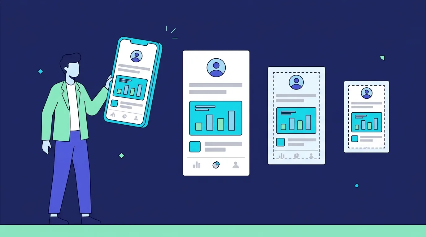
One screenshot file will not serve every place you list. Apple's App Store takes tall portrait images at fixed pixel sizes. Google Play takes a range, enforces a ratio rule, and separately demands a 1024 by 500 banner. An indie directory does neither of those things: it crops whatever it has to a small landscape rectangle and renders it about the width of a business card. The shot that works on all three is the one designed for the smallest frame first. Real data, one idea, type big enough to read at a third of full size, and nothing important within a few percent of any edge.
Most advice about product screenshots stops at the store. That is the easy part, because Apple and Google publish exact numbers and reject anything that misses them. The hard part is everything after the store: the directory card, the newsletter roundup thumbnail, the link preview someone pastes into a Slack channel. Those surfaces crop without asking, shrink without asking, and they are usually the first look a stranger gets at your app.
Where will your screenshot actually be seen?
Three families of surface, with three different sets of rules.
App stores publish fixed specs and enforce them at upload. You get real estate, a gallery, and a guarantee that your image will be shown at close to the size you made it.
Directory and marketplace cards publish almost nothing. Each one picks a card ratio, crops your image to fit, and displays it somewhere between 250 and 400 pixels wide in a grid. You do not control the crop and you rarely get told what it is.
Social link previews are the least predictable of all. Every network crops toward the centre at its own ratio, and messaging apps shrink the result again.
Here is the same information as a spec sheet, with the store figures taken from Apple's App Store Connect screenshot specifications and Google Play's Console Help page on preview assets.
| Surface | Shape | Published requirement | What happens to your image | What has to survive |
|---|---|---|---|---|
| App Store, iPhone 6.9 inch display | Portrait | 1320 x 2868, 1290 x 2796 or 1260 x 2736 pixels. JPEG or PNG, no alpha channel or transparency | Shown in a swipeable gallery. If you skip an accepted size, Apple scales another set to fill it | Headline text and the working part of the UI, high in the frame |
| App Store, iPad 13 inch display | Portrait | 2064 x 2752 or 2048 x 2732 pixels. Required if the app runs on iPad | Same gallery, fewer frames per screen | Same, with more horizontal room to use |
| Google Play, phone | 9:16 portrait or 16:9 landscape | Minimum dimension 320px, maximum 3840px, and the longer side can be at most twice the shorter side | Up to 8 per device type. You need at least 2 across device types before the listing can publish | The first three, which Play asks you to keep UI heavy |
| Google Play, recommendation blocks | 9:16 or 16:9 | At least four screenshots at 1080px or better: 1920 x 1080 landscape or 1080 x 1920 portrait | Placed in large format promotional rows across the store | The whole frame, so keep nothing critical at the edges |
| Google Play feature graphic | Landscape | 1024 x 500 pixels. JPEG or 24-bit PNG, no alpha. Mandatory to publish a listing | Sits above the screenshots, and the video play button overlays it | The centre, because the play button lands there |
| Google Play, Wear OS | Square | 1:1, minimum 384 x 384 pixels, and no device frames allowed | Rendered small in every context | One glanceable state, nothing else |
| Directory listing card | Landscape, commonly between 16:9 and 3:2 | Rarely published. On TryMy we crop to 16:10 from the top and render cards roughly 350 pixels wide in a three column grid | Cropped, then scaled down hard. A 1080 x 1920 portrait shot cropped to 16:10 from the top shows only its top 35 percent | The top left quarter of your interface |
| Social link preview | Wide landscape | No single spec across networks. Google's guidance for article images is a minimum of 50,000 pixels of area, with 16x9, 4x3 and 1x1 crops available | Centre cropped at each network's own ratio, then shown small in feeds | The centre, with generous margins on all four sides |
The pattern in that table is the whole point. Stores give you a big canvas and tell you the exact size. Everywhere else takes a small landscape slice of whatever you hand over. Design for the slice and the canvas takes care of itself.
What makes a screenshot readable at thumbnail size?
There is a test that costs thirty seconds and settles almost every argument. Export the shot, drop it into a document at 350 pixels wide, and look at it on your phone from arm's length. If you cannot say what the app does within two seconds, the screenshot has failed, and no amount of gradient background will fix it.
Four things decide whether it passes.
Type size. Google's own listing guidance warns against overloading a screenshot with small type or with backgrounds that compete with the text, because it will not be legible on many phone screens. The same guidance caps taglines at 20 percent of the image. That is a useful constraint even in the places where nobody enforces it.
Crop. Do not screenshot the whole browser window. Nobody needs your tab bar, your bookmarks, or four hundred pixels of empty sidebar. Crop into the region where the app is doing something, and let that region fill the frame.
Contrast. Thin grey text on a white card looks refined at full size and disappears at a third of it. Push the contrast of anything that has to be read, and treat decoration as expendable.
Weight. Directory cards load in grids of a dozen or more, so a 2MB PNG behind every card makes a page feel broken. Export to WebP where you control the file, which web.dev's guidance on serving WebP images covers well, and keep JPEG or PNG for the stores, which require those formats anyway.
Why does fake placeholder data cost you installs?
Because a reader can tell instantly, and what they conclude is that the app is not finished.
A dashboard full of "Lorem ipsum", "John Doe" and three identical rows reading "Item 1, Item 2, Item 3" says the builder had nothing real to show. It is also against the rules in the places that matter. Play requires that screenshots demonstrate the actual in-app or in-game experience, focusing on core features and content. Reviewers on smaller directories apply the same instinct without writing it down. On TryMy the review is a person opening your app, and the bar is simple: a real, working product, no scams or crypto casinos. A screenshot of an empty state gets the same reaction as a broken link. If the reasons an app gets waved through or bounced are new to you, the app directory submission checklist covers the rest of them.
Fixing this is a seeding problem, not a design problem. Spend twenty minutes putting believable content into the account you screenshot from. Real project names, plausible numbers, dates that are not all the same day. If your app handles other people's data, build a demo tenant rather than blurring a customer's.
How many screenshots do you need?
It depends entirely on the surface, and the counts are further apart than people expect.
Apple accepts one to ten per localised listing. Google Play needs a minimum of two across different device types before you can publish, allows up to eight per device type, and asks for at least four at 1080px or better if you want to be eligible for the recommendation formats that display large screenshots.
Directories are the opposite. Most of them show exactly one image, and many of them, including this one, capture it themselves rather than asking you to upload it. That changes the job. If a directory grabs its own shot, the thing you are optimising is not an export from a design tool, it is what your landing page shows above the fold at a desktop width. A hero section that is nothing but a headline and a button will produce a card with no product in it at all.
So the practical answer is: build one shot that has to carry everything, then build the store set around it. For a browser product the same logic applies to the extension stores, which the Chrome extension launch plan goes through in order.
Do mockup frames help or get in the way?
They help on a landing page, where you have width to spare and the frame gives the image a reason to sit inside a section. They hurt almost everywhere else.
The arithmetic is unkind. Drop a portrait phone frame into a 350 pixel wide landscape card and the bezel, the rounded corners and the empty space either side eat most of the area, leaving a strip of unreadable interface in the middle. Google's guidance goes further than aesthetics: it advises against device imagery in listing screenshots because it dates quickly, and for Wear OS it flatly requires that screenshots not be positioned within device frames.
The rule of thumb that holds up: no frame for anything that will be cropped or shrunk by someone else. A restrained frame or a browser chrome outline is fine on your own page, where you decide the size.
What should the first screenshot always show?
The moment your app does the thing it exists to do.
Not the sign-in screen. Not an empty dashboard. Not the settings page, however proud you are of the toggles. The first frame should show output: the file converted, the summary written, the chart drawn, the invoice sent. Google's listing guidance points the same direction when it asks you to prioritise actual interface in the first three screenshots.
Get this right and the screenshot does the same job as a good one line pitch, which is to make a stranger understand the product before they have decided whether to care. If your listings are getting looked at and not clicked, that gap is usually the reason, and why nobody tries your app walks through the rest of it. The picture and the words have to agree, so it is worth writing them together with the app description for directory listings rather than bolting one onto the other.
One last note about alt text, because it is free and almost everyone skips it. Play recommends alt text on every screenshot, kept to 140 characters or fewer, and warns against starting with "photo of" because screen readers already say that. "The transaction complete screen" is the shape it should take. Directories that surface your listing to search engines benefit from the same discipline.
When the shot is ready, the fastest way to find out whether it survives a real grid is to put it in one. Submit your app free and it lands in the showcase alongside everything else, cropped exactly the way every card there is cropped. The listing is free and human reviewed. If you later want a fixed position at the top, the featured spot is a position and a badge rather than a promise of traffic, and we would rather say that plainly than sell it.
FAQ
What size should app screenshots be?
For the App Store, use one of Apple's published sizes for the 6.9 inch iPhone display, which are 1320 x 2868, 1290 x 2796 or 1260 x 2736 pixels in portrait, plus 2064 x 2752 or 2048 x 2732 for the 13 inch iPad if your app runs there. For Google Play, portrait 9:16 or landscape 16:9, with the smallest dimension at least 320 pixels, the largest no more than 3840, and the long side no more than twice the short side. For directories and your own landing page, a landscape image around 1600 pixels wide is plenty, because it will be scaled down to a few hundred pixels anyway.
Should screenshots have captions?
On the app stores, yes, and keep them short. A caption is often the only text a browsing user reads, and the store galleries are built around captioned frames. Google asks that taglines stay under 20 percent of the image and warns that small type will not be readable on many phones. On a directory card, no. The card already shows your name, tagline and category next to the image, so a caption baked into the picture just competes with the text beside it.
Do I need device frames?
No, and in some places you are not allowed one. Google requires that Wear OS screenshots not sit inside device frames, and advises against device imagery generally because it ages badly. Frames are a reasonable choice on your own landing page, where you control the display size. They are a poor choice for anything that will be cropped and shrunk by a third party, because the bezel eats the pixels that were supposed to carry your message.
How many screenshots should a directory listing have?
Usually one, and often it is not up to you. Most indie directories show a single card image, and many capture it from your site rather than accepting an upload. Plan for one image that has to work alone, make sure your landing page shows the product above the fold so an automated capture finds something worth cropping, and keep the fuller set of three to eight for the app stores where the gallery exists.